


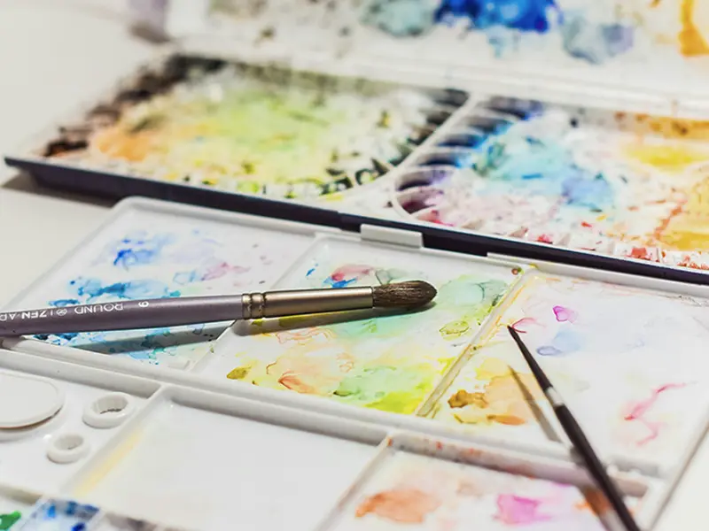
Want to improve the color harmony in your paintings? Start by organizing your watercolor palette logically, and your colors will no longer clash. This article will guide you on planning palette zones, choosing the order of paint placement, and developing proper mixing and cleaning habits, helping you work more efficiently and professionally in watercolor creation.
Many beginners mix colors randomly while painting, resulting in muddy colors, low efficiency, and sometimes forgetting the composition of the colors they just mixed. Proper watercolor palette arrangement offers the following benefits:
👉 Further Reading:Color Wheel – Wikipedia
A Practical Watercolor Palette Is Usually Divided into Three Main Areas
It is recommended to place this area on one side of the palette, such as the top left, and include colors like red, orange, yellow, ochre, and brick red. Warm colors help convey sunlight, emotion, and energy.
Place this area on the opposite side of the warm colors, including blue, cool green, purple, and cool gray. These colors are often used to depict shadows, water surfaces, and cool-toned atmospheres.
Place this area in the center or bottom of the palette, used for mixing grays, skin tones, midtones, and shadow colors. You can also store your frequently used custom mixes here, such as “shadow blue” or “skin gray.”
Below is a common double-layer 12-color palette arrangement. You can make slight adjustments according to your personal preference:
| Top Row (Warm Colors) | Bottom Row (Cool Colors) |
|---|---|
| Chrome Yellow / Lemon Yellow | Prussian Blue |
| Yellow Ochre | Cobalt Blue / Ultramarine Blue |
| Magenta / Crimson | Chrome Green / Green Gold |
| Burnt Umber / Burnt Sienna | Violet / Dioxazine Purple |
| Raw Sienna | Ivory Black (for mixing grays) |
| Blank Area (Clean Water) | Neutral Color Mixing Zone |
Beginners can get familiar with their palette through the following methods:
Establishing proper watercolor palette arrangement habits allows you to find colors more quickly, improve mixing efficiency, and reduce contamination and clutter. When warm and cool areas, as well as neutral and grayscale zones, are arranged logically, your paintings will appear more harmonious and professional.
👉 Want to dive deeper into color harmony and mixing principles? Check out our courses:“Complete Guide to Watercolor Colors and Techniques”|Artify Ho Yeh Studio

Ho Yeh Jianda — An expert in watercolor and oil painting instruction, graduated from the National Taiwan University of Arts, with 30 years of creative and teaching experience. Winner of multiple first prizes in national art exhibitions, he specializes in blending the lines of traditional Eastern ink painting with the brushwork of Western watercolor, guiding students from beginner to advanced levels to discover their own artistic style. For more courses, visit: Artify Ho Yeh Studio.


我們不會發送垃圾信,只會分享水彩課程新消息哦!